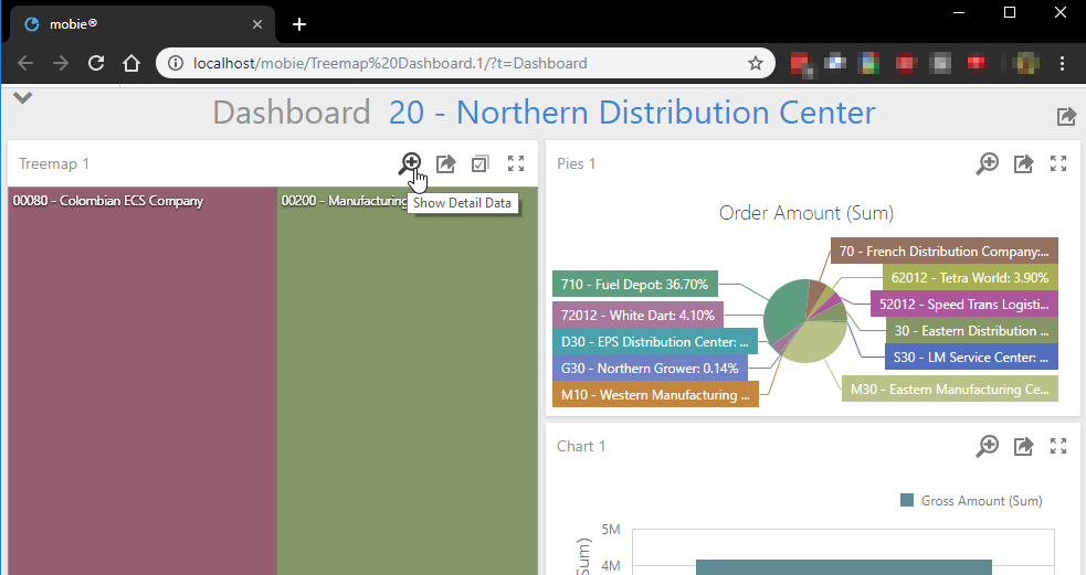
View Detail Data
When viewing a dashboard in a mobie® portal, you can see the data behind each widget by using the popout grid feature.
On the toolbar of each widget, there is a magnifying glass you can click on to view the underlying data that is being rendered in the widget. Click on the magnifying glass (Show Detail Data) to show a grid view of the widget's data.
Disabling the Popout Grid
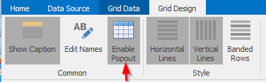
By default, the "Show Detail Data" magnifying glass will be shown for all widgets. It is possible for the designer of the dashboard to disable this feature for individual widgets by going to the Design ribbon tab for the widget and disabling the "Enable Popout" button:
Note that the popout grid feature is not available within the designer - it is a Web viewer only feature.
Data Filtering
Unlike the grid widget that can be shown in the dashboard that summarizes rows of data depending on the set of dimension columns that are selected for the grid widget, the popout grid shows all of the data rows subject to selection criteria. Selection criteria include criteria specified in the design of the dashboard as well as filtering that is the result of interactive selection.
Available Columns
The set of columns shown in the popout grid are the set of columns that are selected for use in the widget. This includes all dimensions and measures, including hidden data items. One use for hidden data items in the designer is to add columns to the available set shown in the popout grid on the Web.
Grid Layout
Once in the pop-out grid view, the default layout of the grid simply shows the grid without any particular organization. Users may change the appearance of the grid in numerous ways, such as:
- Drag column headers to rearrange their order
- Right click on column headers to change sorting, grouping, and filtering
- Left click on column headers to toggle their sort order
- Drag column edges to resize column widths
- Right click in grid footer areas to add summaries
One available option when right-clicking on column headers is to "Auto Group and Sort". Selecting this will automatically group and sort the grid according to characteristics of the original dashboard widget. In particular, dimensions will be grouped and summarized and specified sort orders will be applied. Note that adding grouping and sorting to a popout grid may be slow and result in significant cost to the database.
Changes made to the layout of the popout grid may be saved by supplying a name for the layout and clicking on the save button to the right of the layout dropdown in the upper right corner of the grid. Publishers of dashboards may edit the default layout that is shown to all users by first clicking on the pencil icon when the "<default>" layout is selected prior to making any changes and then saving after changes have been applied. Other layouts saved by the publisher of the dashboard may also be made available to subscribers of the dashboard by marking them as shared by using the toggle in the layout dropdown.
Limitations
Dashboard widgets that use calculated fields will not show data in a popout grid if they use aggregation/windowing functions as these do not translate well to the notion of showing individual detail rows. Summarization functions are removed from expressions in calculated fields prior to processing and are allowed in conjunction with the popout grid.
Exiting the Popout Grid
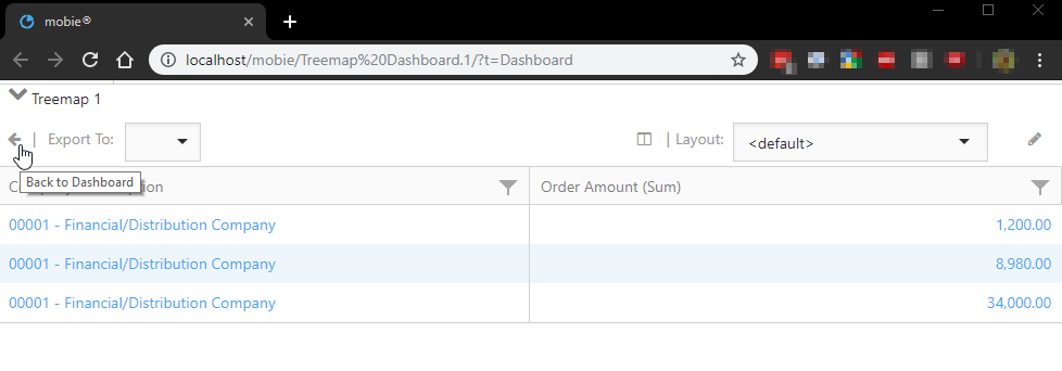
When you are finished viewing the grid data, click on the back arrow <- to return to the dashboard.