Manual Presentation
You can choose to present your report with the Manual presentation option. The Manual presentation provides the most flexibility for simple reports. If your report is complex (for example, you need more than three group levels or have hundreds of thousands of rows of data), you should opt for the Automatic presentation approach (see Automatic Presentation).
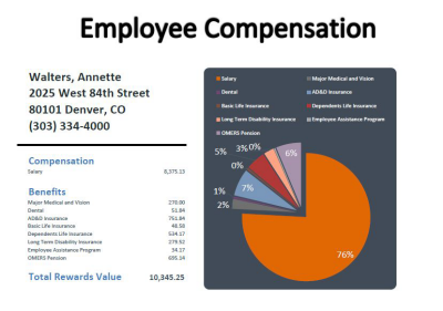
With Manual Presentations, your query comes alive with graphs, dashboards, and pixel-perfect formatting:

To present your data in Excel, right-click a column to get the Column
Menu. Select
 Presentation.
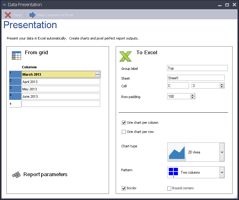
Data Access Studio will display the following
screen:

| To | Do this |
|---|---|
| Add columns to present | Click on the visual assist in the From grid list. Select the columns you want. |
| Re-order the sequence of columns | Click on the grip bar  and drag the column name to the position you want. and drag the column name to the position you want. |
| Map data to Embed Excel but do not graphically present it (old style Embed Excel) | Set Sheet to blank or DASLink. |
| Change the target sheet where you want to present the grid data | Change the Sheet text box to the name of the Excel sheet you want. |
| Change the target cell where you want to present the grid data | Change the Cell column and row values. |
| Change upper limit on the number of rows for the presented data | Change the Row Padding value. The Row Padding value sets the upper limit on the number of rows Excel will present. Pick the smallest number that you know will be bigger than the number of rows you expect from your query and grouping. For instance, if your grid groups business unit and you know that the maximum number of business units for any given query will not exceed 500, then set the Row Padding to 500. If you make this number smaller, it will be easier to format your Excel presentation later. |
| Map data only (and hence do not graph the values) | Select None for Chart Type. |
| Create a chart for each column. X axis = rows and values of the chart are the values in the grid. | Check One chart per column. Select the visual assist for Chart Type and select the type of chart you want. DAS will create an array of that chart type in the Excel presentation. |
| Create a chart for each row. X axis = columns and values of the chart are the values in the grid. | Check One chart per row. Select the visual assist for Chart Type and select the type of chart you want. DAS will create an array of that chart type in the Excel presentation. |
| Specify how you want the graphs to be laid out in the presentation | Click the Pattern option and select how many columns to use when laying out the resulting graphs. |
| Specify borders for your graphs | Check the Border box for borders. Un-check the Border box to create graphs with no borders. |
| Specify round corners for your graphs | Check the Round Corners for round corners. Un-check for square corners. |
Once you have configured the options you want, click the
 Map Columns to Excel to complete the presentation. Whenever you
Map Columns to Excel, DAS
overwrites the previous mapping. Usually, it is a good idea to clear
the target sheet before re-mapping graphs to it.